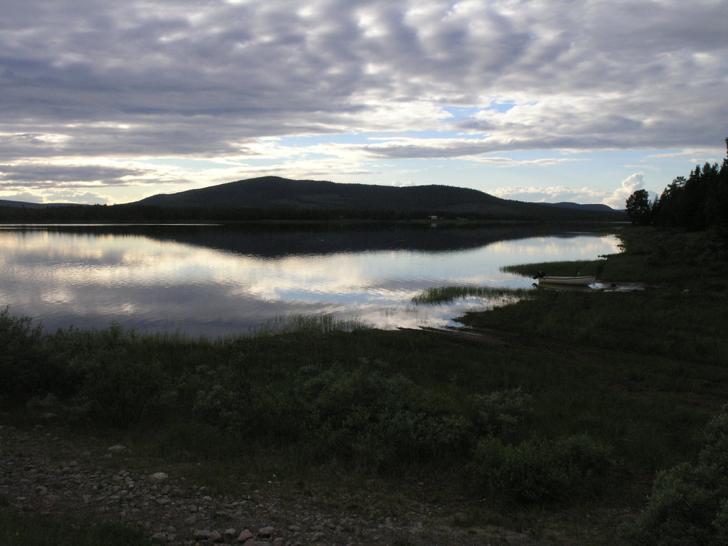
It’s that time of year: this winter’s colours come from a summer evening on the Vindelälv. It’s the first time I have managed to do a light-on-dark design that looks good to me1 and, as always, the trick is to find a picture that looks right and just pick colours for the elements lower down the page with the eyedropper.
UPDATE: I have added a print stylesheet for the benefit of the reader2 who prints everything out before reading it. Does anyone know which is the MT template that holds the entry previews? I think I have the comment previews using the same stylesheet as the finished comments will; but I can’t remember how to get the entry preview looking like that.
1 Well, the first time since green-on-black terminals went out of fashion.
2 Hello Mum!
Very sharp!
It looks great!
Small thing: the cover shots of The Darwin Wars and In The Beginning sandwich (left and right) the text and heading of ‘The Latest Craze’. Looks funny.
In what browser? It’s fine in Opera, and, I think IE.
It is quite incredible frustrating to try and do a simple table in pure CSS — all I want is to have the two books justified left and right, with an empty space between them. At one stage I had a div there invisible in anything except mozilla, which told the users to go away and try in lynx. It looks great in Lynx.
Sorry – should have mentioned: in firefox. But you’ve fixed it now…